
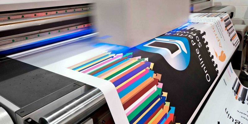
When it comes to getting the finest print in London: they all have a perfect design.
The mistakes are bound to happen in printing quality and the final output. Imagine taking delivery of thousands of brochures with one spelling mistake or price error.
What to do while you come across the final printing output that didn’t reach the way you thought it would?
Must be frustrated, but it is even more when you know that print in London services could have avoided it. A mere lapse of concentration can lead to a disastrous printing error resulting from loss of huge amount and significant money cost. You can also take a look about print cheap.
Here’s the curate checklist that can help you avoid the most common mistakes:
Print Material Cutting:
While you want the print machine to come up with accurate size cuts, there is a possibility that it wouldn’t go by the intended size. It may go extended or lacked by a millimetre or two. The result would be disastrous as you will end up having a thinner or extra white border.
Measure to avoid cutting issues: Prefer keeping some extra space of minimum 5mm. It would assure that no white line remains at any of the edges, especially when the print paper moves.
Margins May Go Beyond the Safety Dimensions.
There could be some possibility that the paper gets excessively cut with the trimming blade moving haywire.
Measure to avoid marginal differences: Keep a minimum safety zone of 5mm, while not writing or placing images beyond that set margin. It is of high importance when you are designing books and booklets.
Dimensions of Document and Print Material
Keeping a check on the page size can save you from huge blunders. The next time you decide to upload the digital artwork with Print in London experts, make sure the important images and text are not at the paper edges or kept too close to each other. If you are unsure about how the quality can turn out to be, here’s Printpal London at your services.
Artwork Color Mode
Leaving the final screens display in Red-Green-Blue color mode may not leave a good impression. Prefer to save your digital artwork in CMYK mode. You can even convert the final print format before getting it printed.
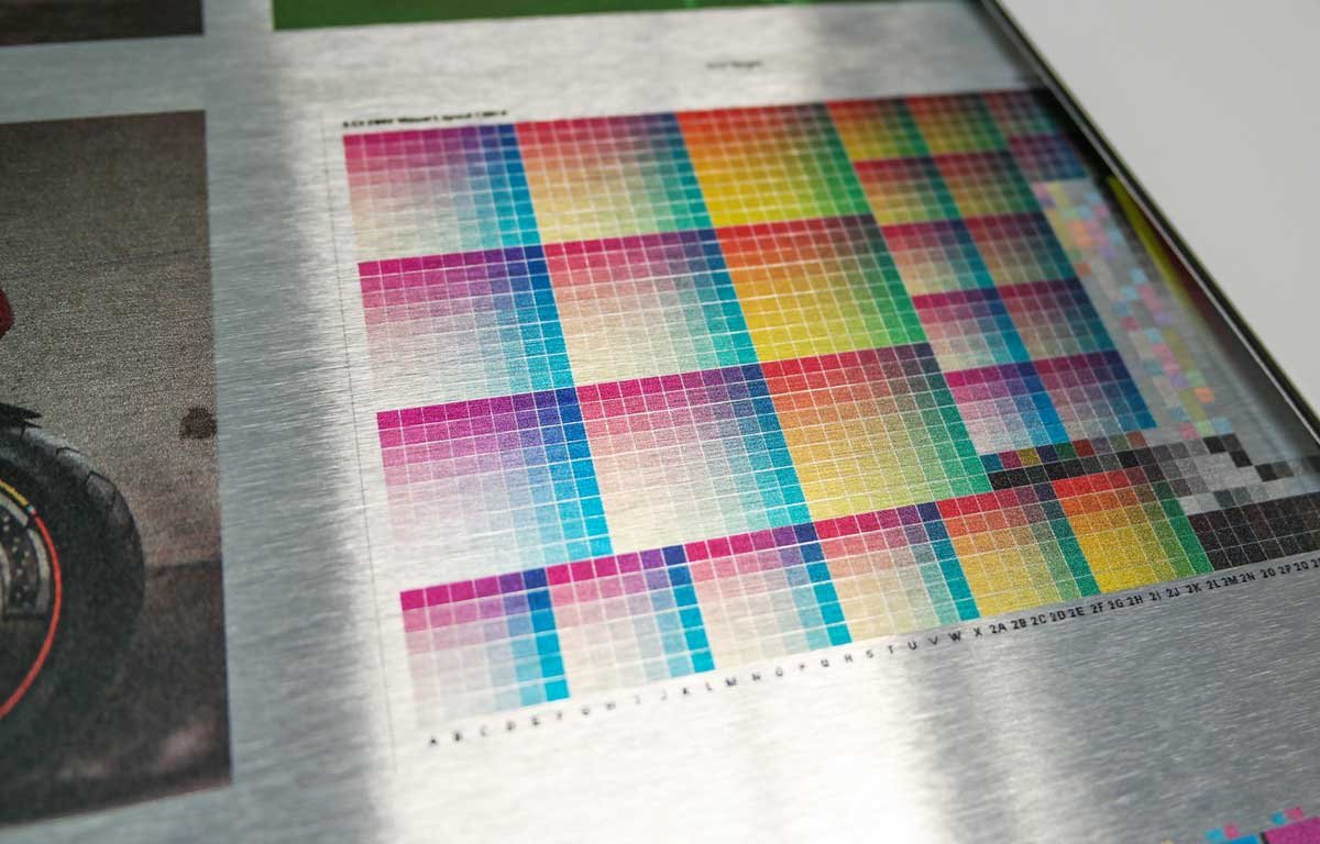
Image Resolution
The print material that appears clear with high-quality images and sharp text and design comes with high-resolution features. When you come across blurry and grainy looking final print, the issue seems to be resolution quality. The images should be sized at 300dpi. The low dimension resolution ones may look good on screen, but the pixels may get blurred in the final print quality. Ensure that you correctly go through its dimensions and see if it is not excessively enlarged from its actual size.
Please give it a Proofread at Least Twice or Thrice.
The importance of quality content stands above everything! Before you hit the send button, look out for any typo errors, spelling errors, and numerical errors. Ask someone else to give it a thorough read to ensure that extra 5 minutes are worth its quality.
Borderline Area
Avoid giving borders as the 20’s era is gone. The risk of excessively trimming may end up the creation of an uneven border area.
Measures to manage border area: Keep a set margin to keep the borders at a specific limit. It brings a safety edge to the bleed area. Make sure the border area gets trimmed off properly.
Ink Coverage in High Quality
If the images come with excessive printing ink, it may leave the paper a bit wrinkled or even bruised. Since we all know that the document can absorb only a certain ink amount, this one should be appropriately taken care of.
How to manage high-quality ink coverage: While utilizing a pre-flight tool, you can check the entire artwork’s ink coverage. This will clarify which of the images come with excessive ink, to resolve accordingly.
Text and Font Dimensions
Things could get trickier if the font size remains to be smaller than 6pt. size. It may leave you with unreadable information and blurred text, which is of no use.
Appropriate Spacing
Giving excessive spaces and uneven margins may hamper the whole look on the final print and the digital print. While it comes out in the final output, it may turn out to be distracting and displeasing for the eyes.
How to keep the font readable: The print in London services takes special care while setting up text sizes. You should at least keep it 6pt in size, as anything smaller than that may leave it illegible.
The next aspect to take care of is using fonts that are recognized in online printer. In a similar case, what could work in your favour is by rasterizing and converting the text in Photoshop. While using Illustrator, you can convert the text into outlines format.


Comments